
The Wrong Theory. Wrongness as a lure, in design and media

Beautifully awkward Katy Perry Left Shark moment. – Shark Ex Machina. – Wrong Olympic snowflake. – Perfectness alienates, wrongness invites. – Human mistakes and the cargo cult of robot journalists. – Give them bait. –Degas’ horse head cut. – How to use it. – Wrong means exists.
Beautifully awkward Katy Perry Left Shark moment
The Super Bowl is one of the most spectacular and expensive TV broadcasts in the world. It usually sparks viral content and memes about Super Bowl ads or the Halftime Show. Mocking Halftime Show slip-ups has even become a sort of Super Bowl tradition. Remember poor Beyoncé’s awkward moves in 2013? They delighted online critics and inspired a wave of photoshop mockery, like this one.
The audience seemed to be waiting for something similar from Katy Perry, the star of 2015’s Super Bowl Halftime. Alas (or not), Katy Perry herself offered no such material for mockery. Instead, Left Shark’s dance happened.

A tsunami of sneers swept over the internet. Here are some examples: Katy Perry’s Sharks Were The Best Part Of The Super Bowl. The Katy Perry sharks are all of us. The sharks became famous.
Shark Ex Machina
The Halftime Show lasted approximately half an hour and included several songs, multiple costume changes, Katy Perry’s ride on a huge animatronic lion, her flight on a star far above the spectators, arresting pyrotechnic effects, dozens of backup performers, and so on and so forth. The Sharks’ awkward, baby-like moves jarred amid the otherwise perfectly managed mega-show. What would that show have been without the Left Shark moment?
Left Shark’s blunder suggests an interesting trick that can be used in media, design, and arts. In the era of gadgetization and automatization, everything that falls out of order can grab attention. Perfection increases the visibility of imperfections—and, therefore, their value.
Wrong Olympic snowflake
The value of wrongness can be used if artists or organizers recognize the opportunity. During another mega show—the Sochi Olympics’ opening ceremony—one of the five snowflakes failed to unfold into an Olympic ring. Considering that these Games were the most expensive in history, this failure was initially a cause for sneering.
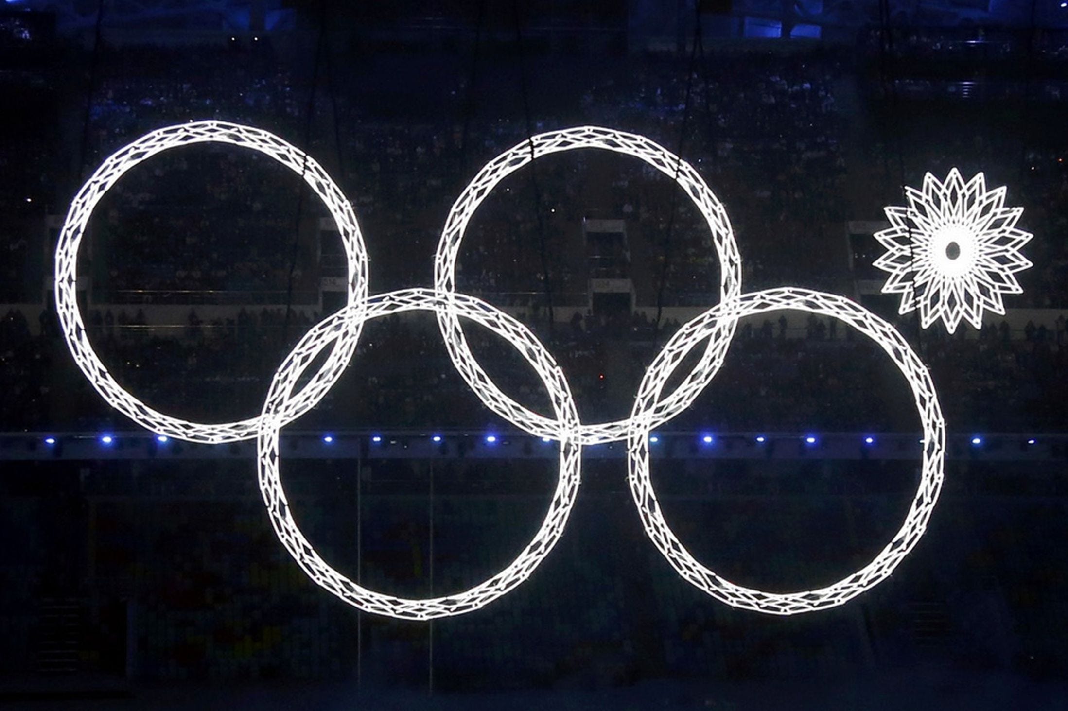
But the ceremony producer was smart enough to turn the failure into value—into the memorable snowflake as a special mark of the event.

Similar to the Left Shark moment, the Snowflake moment occurred accidentally but was immediately and deliberately capitalized upon. By the way, Katy Perry also realized that the Shark moment became the most talked-about episode of her Super Bowl show—not her songs, dresses, or lion ride among stars. She even tried to trademark Left Shark’s iconic design (unsuccessfully).
Perfection alienates, wrongness invites
Blunders and slip-ups provide material for shows like America’s Funniest Home Videos. They generate traffic on social media. What if carefully managed roughness, integrated into well-staged smoothness, could be used intentionally?
Pondering engaging design, Clay Shirky wrote in Cognitive Surplus: “…consider the kinds of kitchens you see in photographs in House Beautiful and Better Homes and Gardens, designed to a fare-thee-well with a place for everything and everything in its place. My kitchen is not like that. (Perhaps, yours isn’t either.) But if you were a guest at a dinner party, you likely wouldn’t dare set foot in a House Beautiful kitchen, because the design doesn’t exactly scream ‘Come on in and help!’ My kitchen, on the other hand, does scream that – you wouldn’t feel much compunction about grabbing a knife and dicing some carrots if you felt like it.”

Something similar—a trick of self-deprecation—is used by politicians pretending to be a "next door" person, though in reality, they rarely are. Perfection alienates; imperfection lets the audience in.
Human mistakes and the cargo cult of robot journalists
Not only wrongness but even mistakes can create value. For example, when robot journalism outperforms human writing, it’s precisely mistakes that will define the peculiarity and value of human journalism. Many news outlets do not hesitate to show their mistakes and corrections; it makes them human.

An error signifies humanness—if not made by a robot. It’s quite possible that writing algorithms, in their pursuit of the human quality of journalism, will learn to insert human-like mistakes to simulate humans. In industries that sell human relationships, robots will strive not to be better, but worse—to match humans. Alan Turing spins in his grave.
In the future, when robots become not just writers but also readers, the practical need to simulate humans by making errors will disappear. However, robots will still use errors, much like the clicking sound of shutter in smartphone cameras today is still in use, even though there is no mechanical shutter inside, and most users don’t even know why taking a picture sounds like that. Similarly, craftily inserted human-like errors will become a cargo cult in the robotic community.
Degas’s horse head cut
In September 2014, Scott Dadich, the editor-in-chief of Wired, explained the Wrong Theory in an article titled “Why Getting It Wrong Is the Future of Design.” He began with Edgar Degas’ Jockeys Before the Race, painted in the late 1870s. The perfectly trained neoclassicist, Degas suddenly placed an asymmetrical vertical pole right in the foreground of his painting, cutting across one of the horses’ heads. It was, no doubt, an artistic provocation—an affront to common rules. Critics pounced on the painter, but later, such gimmicks became an artistic tool.
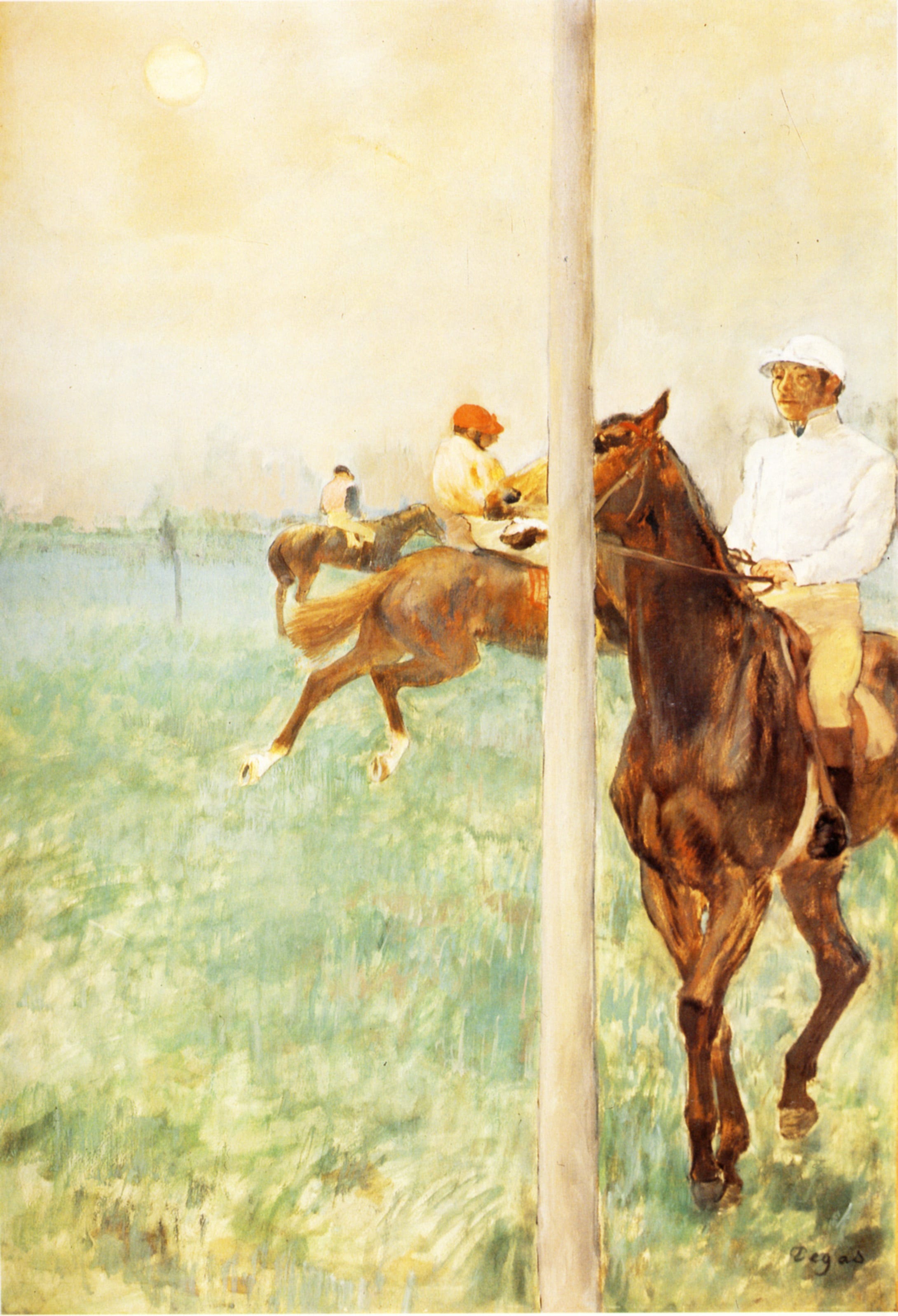
Analyzing Degas’s transgression, Dadich described the evolution of rules across “every artistic and creative field” (and we can extend this to many human practices). At first, “practitioners dedicate themselves to inventing and improving the rules—how to craft the most pleasing chord progression, the perfectly proportioned building, the most precisely rendered amalgamation of rhyme and meter… But once a certain maturity has been reached, someone comes along who decides to take a different route. Instead of trying to create an ever more polished and perfect artifact, this rebel actively seeks out imperfection—sticking a pole in the middle of his painting, intentionally adding grungy feedback to a guitar solo, deliberately photographing unpleasant subjects. Eventually, some of these creative breakthroughs end up becoming the foundation of a new set of aesthetic rules, and the cycle begins again.”
So, Degas deliberately created something unpleasing—within the prevailing system of coordinates.
Further, Dadich suggests a kind of manifesto of what he calls the Wrong Theory:
“All of this has resulted in a world where beautifully constructed tech is more powerful and more accessible than ever before… After years of experimentation, we have figured out what people like and settled on some rules… But there’s a downside to all this consensus—it can get boring…
This brings us to an important and exciting moment in the design of our technologies. We have figured out the rules of creating sleek sophistication. We know, more or less, how to get it right. Now, we need a shift in perspective that allows us to move forward. We need a pole right through a horse’s head… It’s time to stop figuring out how to do things the right way and start getting it wrong.”
How to use it
Curiously, Dadich applied the Wrong Theory in his own artistic practice—almost accidentally. In 2006, then creative director at Wired, he designed a cover that was perfectly stylish. But his boss demanded something else—some color in the gray design. After long arguments and numerous attempts, Dadich, almost in desperation, added an awkward, flashy orange bar in a random spot, with no clear alignment to other elements.
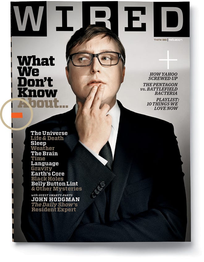
“At the time, this represented a major creative breakthrough for me – the idea that intentional wrongness could yield strangely pleasing results,” reflected Scott. “Of course I was familiar with the idea of rule-breaking innovation—that each generation reacts against the one that came before it, starting revolutions, turning its back on tired conventions. But this was different. I wasn’t just throwing out the rulebook and starting from scratch. I was following the rules, then selectively breaking one or two for maximum impact.”
“I began referring to this idea—intentionally making ‘bad’ design choices—as Wrong Theory, and I started applying it in little ways to all of WIRED’s pages. Pictures that were supposed to run large, I made small. Where type was supposed to run around graphics, I overlapped the two. Headlines are supposed to come at the beginning of stories? I put them at the end. I would even force our designers to ruin each other’s ‘perfect’ layouts.”
What started as an almost emotional jest became an artistic approach. Soon, he began noticing it here and there (in the article, he presents a selection of such examples).
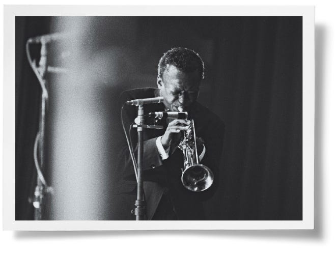
Here is a lightmark on a picture of a jazzman—normally considered a technical defect—but in fact, it enhances the image with an even more ecstatic sensation.
Dadich suggests that this strategy can be successful only when the rest of the performance is perfect. “You need to know the rules, really master their nuance and application, before you can break them.” Wrong should be something, not everything (as that would have a different effect).
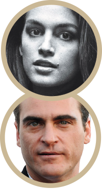
Captivated by the idea, Dadich found research confirming that something unexpected can activate the pleasure centers in our brains. “Think of Cindy Crawford’s mole or Joaquin Phoenix’s scar,” he writes. “Both people are stunning, but they stand out for their so-called imperfections. A better thought experiment might be to put that child in a room with 99 symmetrical faces and one asymmetrical one. Which one do you think she’ll be drawn to?”
Wrong means exists
Of course, many artists and innovators advanced their visions by making deliberately “wrong” choices. Violations of rules, including the use of wrongness in all its forms, are a well-known artistic practice. Today, however, wrongness acquires new value due to algorithms that make our lives more standardized than ever.
Standardized production and consumption save efforts. But what fits the standards becomes invisible. Electric outlets are invisible until you get to Europe. In fact, the very existence of outlets becomes apparent only when you come across a different type. The only way to “experience” the light switch in your room is by not finding it in the familiar place. It is only wrongness that proves the existence of rightness. Or maybe even more: it is wrongness that proves the very existence of things.
An error is something that the algorithm seek to avoid (unless is is specifically designed to produce errors, like malware). The error destroys the invisible prison of standardization, unleashing a personal attitude towards what appears as wrongness, or the mistake, or the aberration, or the amateurishness. Surrounded by algorithms, we will increasingly react to their malfunctions.
That is why TV and web audiences were impressed not as much by Katy Perry’s performance as by her backup shark’s awkward dance. There could be a lesson: learn from the shark, follow Degas. Use minor wrongness amid the boring orderliness to let the audience in. In general, any project dominated by standards should contain a grain of lovely wrongness to be attractive or at least visible.
(Actually, it doesn’t even have to be lovely.)
To conclude, here are several examples of artwork that have gone viral thanks to the ‘well-done wrongdoings’ within them.
Vienna State Opera, funny ballet
Ballet is high art, based on the perfection of bodily expressions. Here is an example of the deliberate application of the Wrong Theory to make a highly standardized practice attractive even to those who are not very much into it. This is a bit of well-managed imperfection amid universally acknowledged irreproachability. I bet that reaching such a highly synchronized level of asynchronization is much harder than incorrectly performing the Sharks’ dance.
A back-up guy with a tambourine rocks
Here is a lovely song; the video, however, became viral because of a guy with a tambourine who seems not to participate much in performing the song but really fires up. There is no special part for the tambourine in the song, so the jovial fellow is used to make a hectic background. (There should be some precaution in applying such a technique, as a character like him, when overdoing it, can easily overshadow the main performance. Here, it didn’t happen, fortunately.)
(2015)
Some more examples (later additions)
Here is the Japanese aesthetic of wabi-sabi, the beauty of the “imperfect, impermanent, and incomplete,” which conveys a somewhat similar idea.

Here are examples from the media: wrongness has turned photo reportage into art.

See also books by Andrey Mir:
The Viral Inquisitor and other essays on postjournalism and media ecology (2024)
Digital Future in the Rearview Mirror: Jaspers’ Axial Age and Logan’s Alphabet Effect (2024)
